Case Study, Web & Mobile
Mavapay
A bridge between Bitcoin and local currency: designing Mavapay Money, the consumer app that lets people receive Bitcoin over Lightning and convert it to their local bank account.
Overview
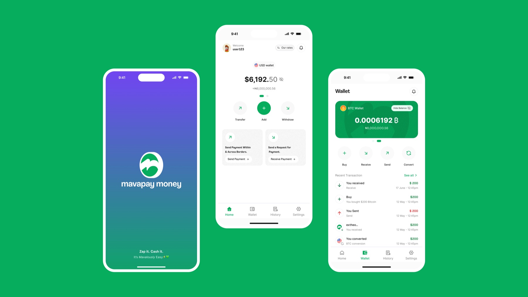
Mavapay has two core products: an API for businesses settling cross-border payments across Nigeria, Kenya, and South Africa, and Mavapay Money, a consumer app that bridges Bitcoin and local currency. This case study focuses on Mavapay Money, which I designed end to end starting from its original landing page.
Mavapay Money launched with a simple premise: sign up, complete KYC, and instantly get a Lightning address to receive Bitcoin from any Lightning-enabled wallet, settled straight into a local bank account. In its first year in beta, it grew to 3,000+ users, processing more than $150,000 in transaction volume across 3,000+ transactions.
The problem
Sending money across borders is harder than it should be. Businesses deal with long settlement times, high fees, and unpredictable exchange rates paying suppliers or receiving funds abroad. On the individual side, more people are exploring Bitcoin to save, send, and spend, but most tools for moving between Bitcoin and a local bank account are unreliable, slow, or carry a real risk of getting scammed.
Mavapay exists to remove that friction: fast, affordable settlement for businesses, and a secure, simple bridge between Bitcoin and local currency for individuals.
Approach
I started by sending surveys to primary users to understand their real pain points, then studied other financial and Bitcoin apps so Mavapay Money would feel familiar rather than something people had to re-learn. From there I followed a three-step process: Understand (stakeholder and user insight, competitor analysis), Create (value proposition, user flows, wireframes, prototypes), and Iterate (review with stakeholders and engineering, then refine).
Research kept surfacing the same signal: users wanted a very simple app that let them buy and move Bitcoin without friction.
The homepage challenge
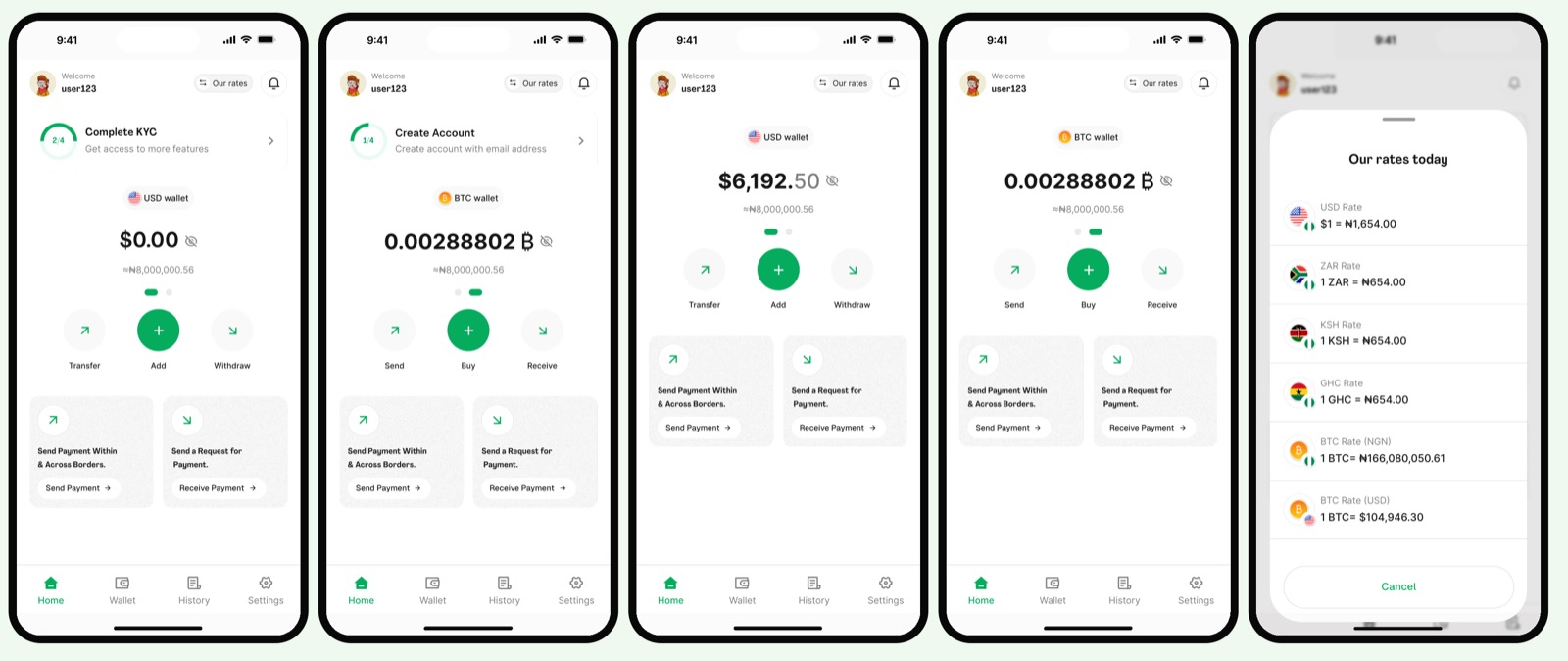
The biggest design challenge was deciding what belonged on the homepage, the first real point of contact for a new user, without it feeling overwhelming. Early iterations kept running into the same problems: users had to click twice just to switch wallets, the Lightning address was too prominent given it was tied to three different destinations, and fitting the primary actions and rates above the fold made an already dense screen feel cluttered.
One iteration reduced everything to a single CTA, which cut cognitive load but hid other actions users actually needed, trading clarity for discoverability. Another surfaced the exchange rate directly on the homepage and deprioritized the Lightning address, but the screen still felt overloaded and the address remained too easy to stumble into.
How I solved it
The fix was prioritization: surface only what a new user actually needs first, sending, receiving, and viewing balances, and move everything else into menus or progressive flows. That reduced clutter and kept the homepage confident rather than overwhelming, while still giving advanced users room to grow into the rest of the app.
Lessons
- Designing for adoption isn't about removing complexity, it's about revealing it at the right time
- Listening to users early and often, through surveys and feedback sessions, kept the product grounded in real needs
- Long working sessions with developers and stakeholders made sure what shipped was both user-friendly and technically feasible
See Mavapay Money live at mavapay.co, or explore the user flow on Figma.