Case Study, Mobile App
Tando
Redesigning one of Africa's fastest-growing Bitcoin payment apps, after running usability tests with real users at the Africa Bitcoin Conference in Nairobi.
Overview
Tando lets anyone in Kenya pay at any M-Pesa merchant using Bitcoin: instantly, privately, and with zero fees, without merchants having to change anything. By integrating with the Lightning Network and adopting a familiar M-Pesa-like interface, Tando lowers the barrier to everyday Bitcoin usage.
The research
As part of a UX Bootcamp fellowship, I ran in-person usability testing on the live app with real attendees at the Africa Bitcoin Conference in Nairobi. I observed how first-time and returning users handled onboarding and sending money, and noted where they got stuck.
What worked: fast, no-KYC onboarding; a send-money flow users found faster than M-Pesa; clear transaction progress feedback.
Where users struggled: no clear way back to the home screen, unclear next steps around scanning a QR code, no visible transaction history or multi-currency clarity, and failed transactions on certain phone number formats.
Goals
- Simplify navigation, with a clear way back to home from anywhere in the app
- Guide first-time actions like scanning a QR code
- Show amounts in KES, sats, and BTC, with a visible transaction history
- Handle edge cases (like failed transactions) with clear, user-friendly errors
- Preserve the speed and simplicity that made Tando fast to begin with
Approach
I mapped every pain point from testing to a concrete design change: "no clear way back to home" became a persistent back button on every core action. From there: low-fidelity wireframes and flow diagrams to nail navigation before pixels, then high-fidelity screens. Given Kenya's variable connectivity, I optimized for quick loading, readable type, and high-contrast visuals that hold up outdoors.

Before & after
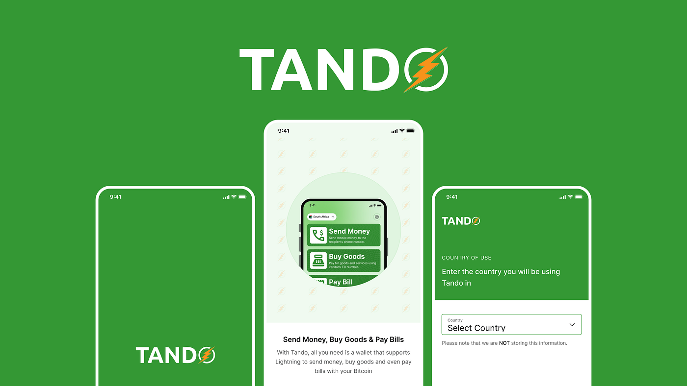
Onboarding: a more robust flow that explains, in plain terms, what Tando does and what to expect.
Homepage: reduced four CTAs down to three, each with a short description so it's clear what each one does.
Transaction history: a dedicated tab with status and timestamps, a details page per transaction, and subtle animation to confirm successful payments.
Lessons
- Familiarity accelerates adoption: mirroring M-Pesa's interface helped users understand Tando's flows instantly
- Small details build trust: transaction history and clear error states go a long way
- Guided onboarding matters even in a simple app: setting expectations early reduces confusion later
Testing in a real, live environment, not a lab, surfaced edge cases and authentic behavior a moderated session likely would have missed.
Most UIs shown here are early exploration, not the final shipped product. The Tando team is keeping that under wraps until launch. Read the full write-up, with all the wireframes and screens, on Medium.